Imagining a better smartwatch interface
ChronOS
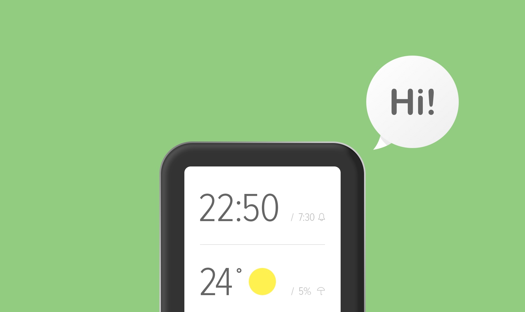
It’s 2018 and it’s easy to say that smartwatches still kinda suck. We don’t really know what they supposed to do, how we supposed to use them or do we even need them. Needless to say, back in 2014 - before Android Watch and Apple Watch came out - the vision of a wearable was even less clear. That’s why I decided to experiment with a UI on a tiny screen.
The idea
Ever since I've started thinking of designing ChronOS, I was pretty sure it had to be simple to use, friendly and most importantly out of your way. No new major paradigms and tricky hardware tricks/combinations - all to ease the learning curve - just simple and consistent gestures.
Basics first
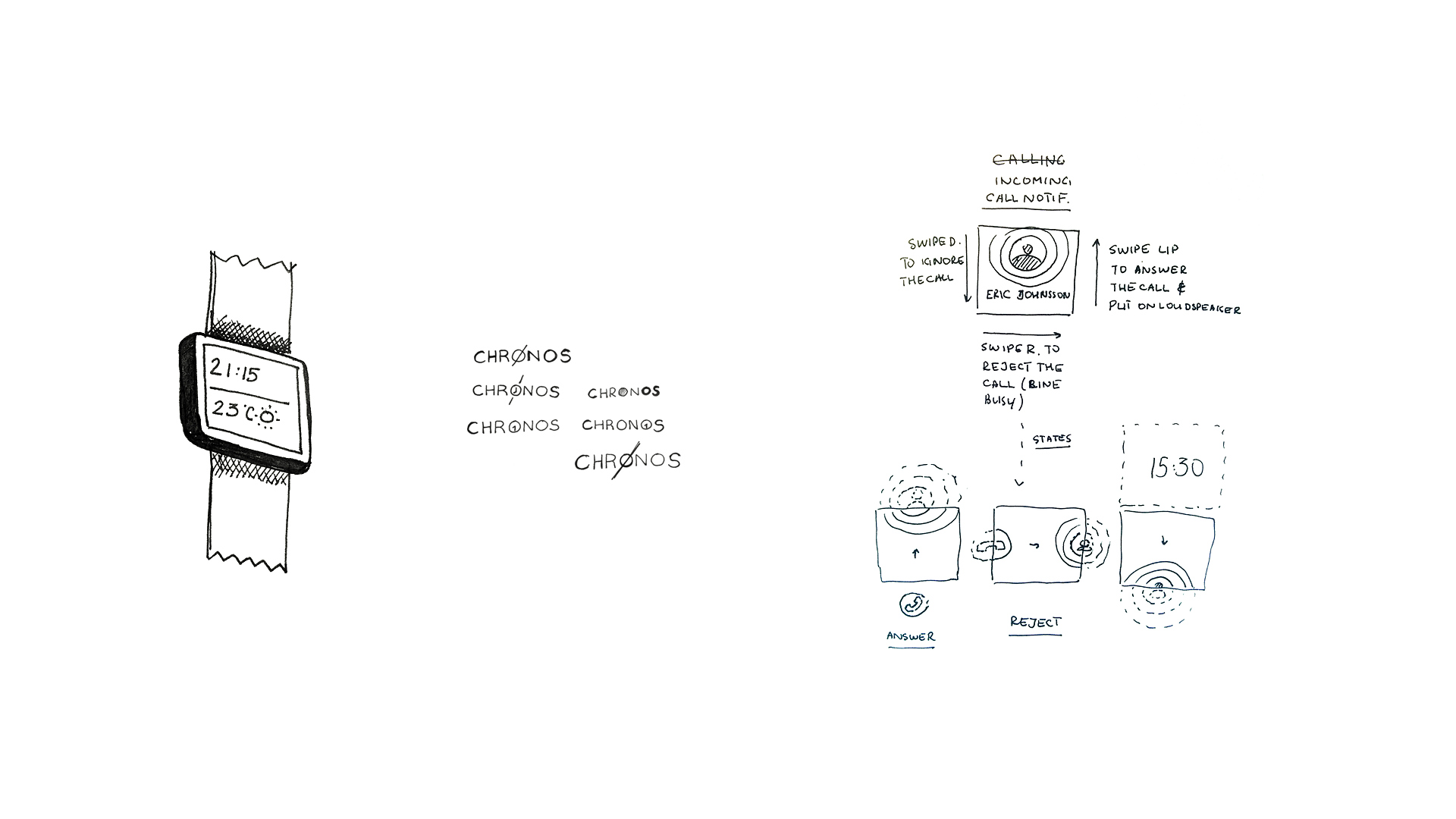
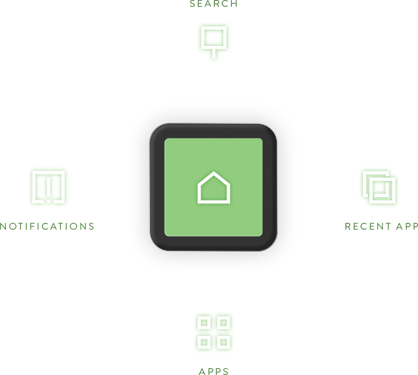
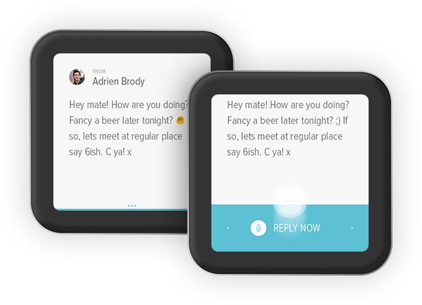
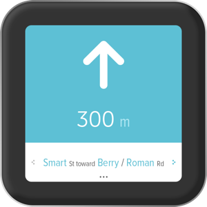
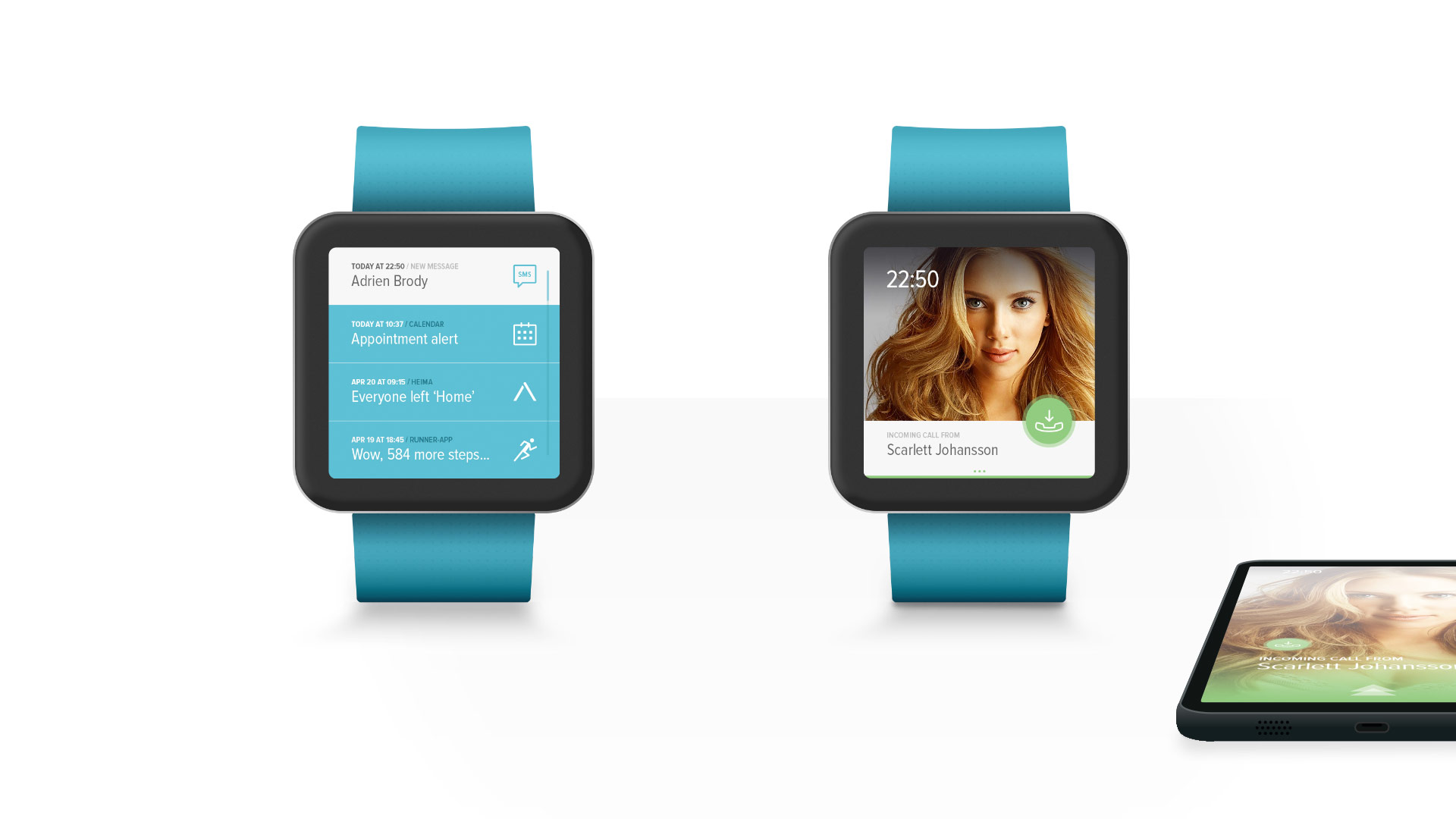
It's important to build a consistent mental model of how user navigates the UI. ChronOS has an ultimate 'escape' gesture that always brings you home from any screen. Notifications are always on the left, search is always a swipe from the top, recent app is on the right while other apps are below the home screen. Everything else is contextual.
No buttons
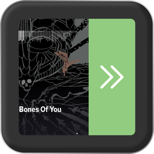
I envisioned ChronOS being a gesture-only UI that would be navigable by swipes. Depending on where you swipe from or the context the user would jump between tasks hassle-free. I've placed affordances and signifiers around the UI to make sure user knows he can interact with it.
YEAR
2015
TEAM
Self-initiated
ROLE